There is a reason a recent Bored Panda feature on “design examples that show how important proper spacing really is” went instantly viral. People weren’t just laughing at disastrous logos and botched kerning; they were instinctively reacting to something deeper: when spacing is wrong, everything feels off—cheap, awkward, and unintentionally comical.
In high-end cosmetic dentistry, the exact same principle applies. The difference between a forgettable smile and a refined, effortlessly natural one is rarely about “perfect teeth” in isolation. It’s about micro‑spacing, proportion, and visual rhythm—exactly the details non‑dentists are suddenly obsessing over in those trending design fail screenshots.
Today, inspired by that viral conversation around spacing and kerning, we’re unpacking how design thinking translates directly into modern Smile Design—and why, in 2025, the most coveted smiles are not the whitest, but the best designed.
---
1. Why “Kerning” Isn’t Just For Fonts: The Art Of Tooth Spacing
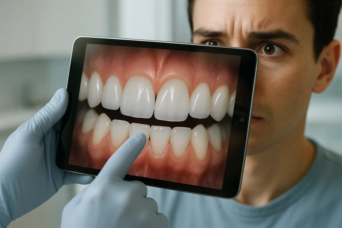
In the same way a poorly kerned word can instantly cheapen a luxury brand’s logo, uneven or poorly planned tooth spacing can undermine even the most expensive dental work. In digital smile design, we talk about emergence profile, contact points, and black triangles the way typographers talk about letter spacing. The eye doesn’t always know what is wrong—but it absolutely knows when something feels crowded, gappy, or off‑balance.
Premium Smile Design uses high‑resolution photography and facially driven software to map how light, shadow, and space interact between each tooth. For example, a tiny triangular gap near the gum line can make a youthful mouth look prematurely aged, just as a poorly aligned logo can make a high‑end boutique look like a discount store. Composite bonding or porcelain veneers can be sculpted in microns to soften these negative spaces, preserving a hint of individuality while removing visual “noise.” The result isn’t “perfect” in the artificial sense; it’s harmonious—the dental equivalent of perfectly spaced, beautifully set type on a luxury print ad.
---
2. Symmetry Is Overrated: Why Luxurious Smiles Embrace Asymmetry
Those viral design fails work because they violate our expectations of order and alignment—but here’s the nuance most miss: the most luxurious experiences rarely aim for mechanical symmetry. High fashion typography commonly uses subtle asymmetry to feel modern and elevated. Your smile should operate the same way.
In advanced Smile Design, we respect the central axis of the face and the symmetry of the two front teeth, but we intentionally allow for micro‑asymmetries: a slightly different curvature on a lateral incisor, a canines’ line angle that’s a touch more pronounced, a marginally varied translucency from one side to the other. These details prevent that “piano key” or “dentures in a day” effect that social media is increasingly calling out as inauthentic. Just as a designer knows that perfectly mirrored layouts feel sterile, your cosmetic dentist knows that a controlled, elegant asymmetry reads as human, expensive, and quietly confident.
---
3. White Is A Shade, Not A Strategy
In the same way the trending spacing article proves that context defines how we read text, context also defines how we read tooth color. A blinding, cool‑blue white on a 50‑year‑old face can feel as jarring as Comic Sans in an investment firm’s logo. Luxury dentistry in 2025 is moving decisively away from “one‑shade‑fits-all” Hollywood white and towards tone‑matched whitening and bespoke porcelain layering.
A refined Smile Design plan evaluates your skin undertone, sclera (eye white) color, lip hue, and even wardrobe palette. Warmer complexions often look best with a slightly creamier, champagne‑tinted enamel; cooler complexions may suit a more neutral or icy white, but with careful translucency at the edges to avoid a flat, opaque look. Think of it this way: the wrong white looks applied, like a filter. The right white looks inevitable—so integrated with your face that friends will compliment how “rested” or “radiant” you look, rather than asking if you “got your teeth done.”
---
4. The New Luxury: Smiles Designed For How You Move, Not Just How You Pose
If the viral kerning fails taught us anything, it’s that static design is no longer enough. We notice how text behaves on different screens, sizes, and contexts. Similarly, modern Smile Design must anticipate your smile in motion: speaking, laughing, mid‑conversation on a 4K camera.
Refined clinicians now use video‑based smile analysis, not just single before‑and‑after photos. They study how much gum you show when you laugh, how your lower teeth appear during speech, and how your lips frame your teeth from multiple angles. This dynamic mapping informs decisions about tooth length, incisal edge shape, and how aggressively to correct crowding or rotation. A slightly rotated tooth that looks charming in motion may be intentionally preserved, while a too‑long veneer that looks fine in a posed photo might be shortened once the dentist sees how it “clacks” against the lower lip mid‑speech. The brief has changed: we are no longer designing for the close‑up selfie; we are designing for real‑time, 360‑degree life.
---
5. Why “Cheap But Fast” Smiles Age Like Trend Fonts
Those “real estate listings from hell” and “design from hell” posts go viral because they expose a truth everyone feels: shortcuts in design are impossible to hide. In cosmetic dentistry, mass‑market “smile in a day” offers that ignore facial harmony, occlusion (your bite), and long‑term gum health are the aesthetic equivalent of a low‑resolution logo stretched across a billboard.
A premium smile makeover is built like a timeless visual identity system, not a one‑off flyer. That means investing in:
- **Comprehensive diagnostics**: 3D scans, photographs, facial analysis, and sometimes wax‑ups or 3D mockups you can actually try in your mouth before committing.
- **Material strategy**: choosing between high‑end lithium disilicate, layered porcelain, or meticulously polished composite depending on location, bite, and lifestyle.
- **Biologic respect**: preserving as much natural tooth structure as possible, managing bite forces, and designing margins that respect the gums so your results look *better* five years from now—not worse.
- **A cohesive aesthetic narrative**: your teeth, lips, facial features, and even your professional and social presence taken into account, exactly the way a luxury brand aligns its packaging, website, and print.
The result is a smile that doesn’t just photograph beautifully this season; it belongs to you in a way that will still feel relevant when today’s trends are the kerning fails of tomorrow.
---
Conclusion
The viral fascination with spacing, kerning, and design “fails” is more than internet entertainment. It’s a cultural wake‑up call: people are becoming exquisitely sensitive to visual detail. That same critical eye is now being directed at cosmetic dentistry—at veneers that look too uniform, whitening that looks too stark, and smile makeovers that ignore the face they sit in.
For those considering a dental transformation, the lesson is clear: do not shop for a smile the way you’d shop for a shade chart. Look instead for a clinician who thinks like a designer—who understands spacing as rhythm, color as context, and your smile as part of a larger, beautifully orchestrated whole.
In a world suddenly obsessed with what goes wrong when spacing is careless, the most luxurious choice you can make is a smile crafted with the same precision, restraint, and intentionality as a perfectly set line of type in a couture magazine.
Key Takeaway
The most important thing to remember from this article is that this information can change how you think about Smile Design.


